Representative Example
A contact form that was losing inquiries halfway through
A business depending on its website for new work — with a form that people started but often didn’t finish.
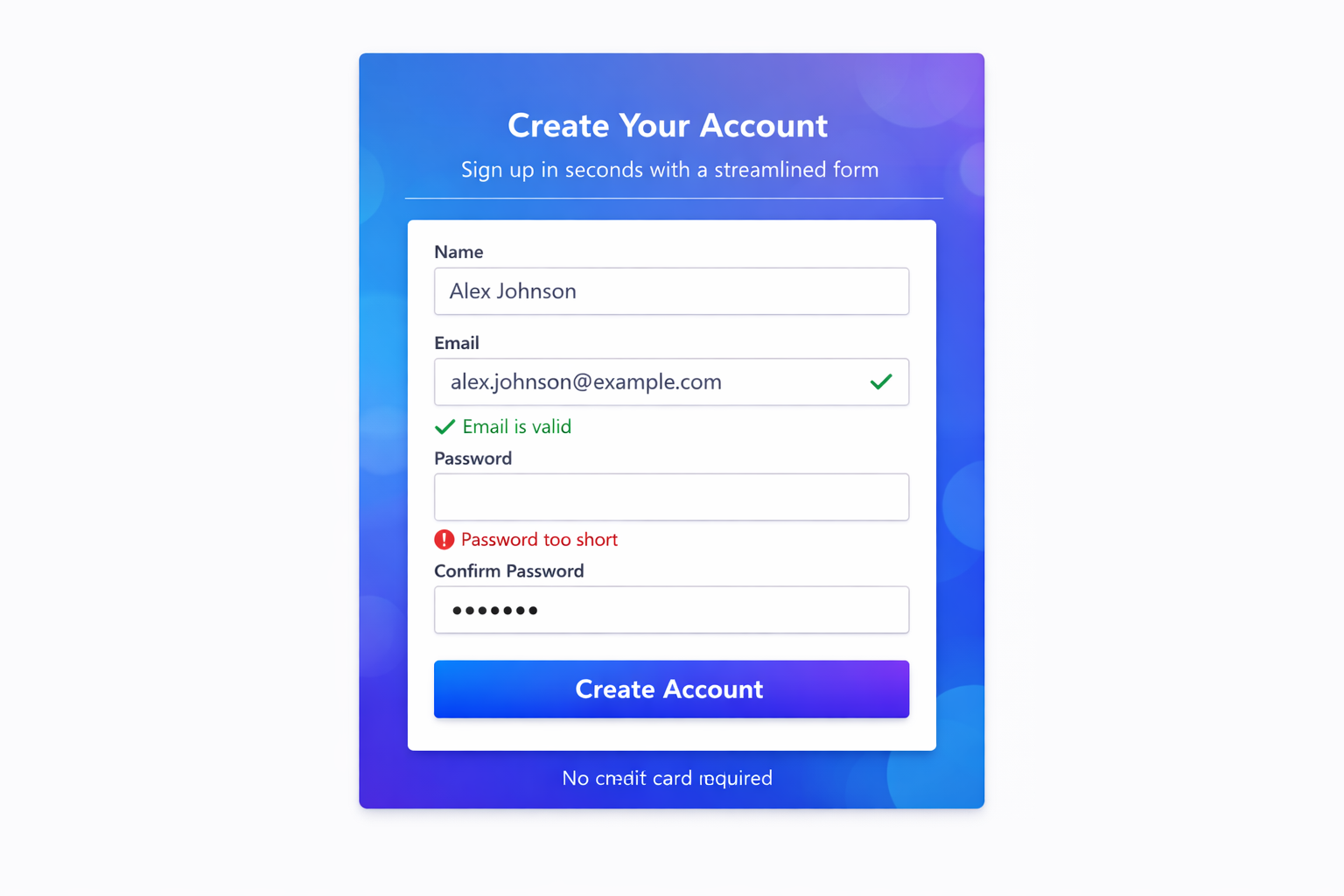
Problem
The website contact form was the main path for new inquiries — but people often started it and didn’t send it. Partial submissions and abandoned forms were a recurring pattern.
Observation
Error messages only appeared after submit — not while someone was still filling it in. Field labels used internal language. Required fields weren’t marked until validation failed, so people only discovered problems at the end.
Recommendation
Mark required fields before someone starts. Validate as they type so errors appear in context. Rewrite labels in plain language. Put the most common inquiry type first so the form matches how people actually reach out.
Outcome
The form stopped being a gap between interest and inquiry. People could finish without guessing what the site wanted from them — or discovering a problem only after clicking submit.
Before vs After
Before
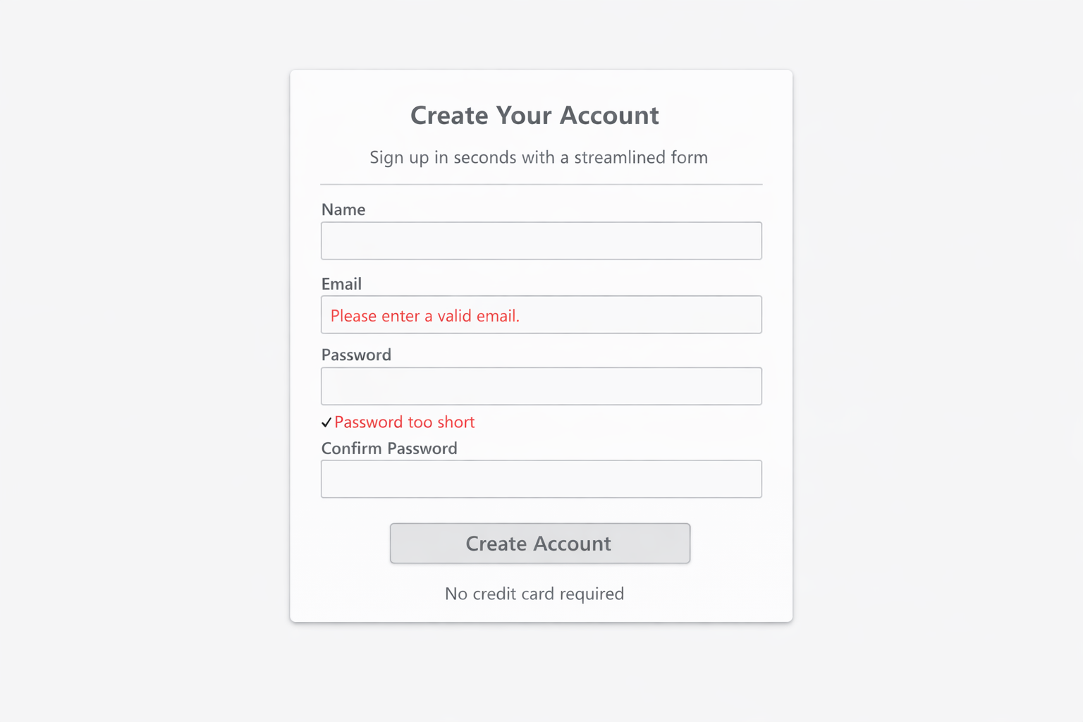
- Errors only after submit — too late to recover easily
- Labels that didn’t match how clients described their needs
- Required fields invisible until validation failed
After
- Required fields marked before typing starts
- Inline feedback while the form is in progress
- Plain-language labels aligned to how people inquire
See the rebuilt contact form
This is the form after the recommendation was implemented — including inline validation and plainer field labels.
Audit note: A form that only talks back after submit is telling people they wasted time. Fix the labels and validation first — before redesigning anything else on the page.
Summary
The contact path now matches how people actually inquire — with fewer dead ends between “I’m interested” and “message sent.”
Seeing the same problem on your site?
Start with a website audit. I’ll tell you what’s blocking people and whether a fix like this is worth building.